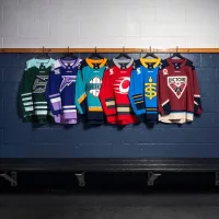
The Professional Womens Hockey League (PWHL) jerseys have been released today and let’s say most need to be redesigned in my opinion. A couple months ago the league which later this month will start their second season, released the team names and logos for their 6 franchises which are the Toronto Sceptres, Boston Fleet, Ottawa Charge, Minnesota Frost, Montréal Victoire and the New York Sirens. The home uniforms I feel are better than the coloured away ones. Here are my rankings and little blurb as to what I like and dislike from the jerseys.
 1. Montréal Victoire
Both the home and away really stand out with the maroon and off white colours, while I do not like hard box like outline on the dark jersey it isn’t that big of a deal to me, it works much better on the home white ones. They just seem to have gotten them right something that cannot be said for some of the other teams in the league.
 2. Boston Fleet
The runner up in the inaaugral playoffs for the league and the runner up for the best jersey. Honestly it was close between them and Montreal, but I don’t think the logo really pops on the green uniform, but the on the home white jersey, “Good Golly Miss Molly” that might be the best overall one, but as a pair, which is how they are being judged it finds itself second to Montreal … how many times have Boston hockey fans had to hear that over the years.

3. Toronto Sceptres
In another close battle for a podium spot Toronto secures it in my books. The light blue jerseys and the lighter gold shade for the logo work well to contrast and the logo stands out from the background. I feel this is what gives it over the edge from the fourth spot.
 4. Minnesota Frost
In the 4th spot is the inaugural league champion Minnesota Frost. I really like the purple jersey, even if it resembles the NHL fight cancer warm up jersey they used to wear. Even with the white outline on the away jersey the logo even with a lighter purple shade gets a little lost on it. We need more purple jerseys in hockey.
 5. New York Sirens
In a battle of the worst it is not an easy decision, amongst myself and the hockey loving news team this jersey was either in this fifth spot or last. I give it the edge because I don’t hate the logo as much as the last place ranked jersey. The word “Sirens” in the same colour as the jersey just blends in and looks like a mistake or an after thought on the dark ones but look better on the white (a common theme) but yet isn’t the worst despite the colours.

6. Ottawa Charge
Taking the last spot is the team in our nations capital. These look like a Wish or Temu version of the Calgary Flames. Just AWFUL from the thin yellow line and the logo in genreal. The Charge really need to hit the drawing board from the name, logo and uniforms, I’ve seen better jerseys amongst the worst beer league ones.
The hockey loving Trending 55 news team has weighed in with their jersey rankings
Kyle:
1. Montreal
2. Minnesota
3. Boston
4. Toronto
5. New York
6. Ottawa
Keith:
1. Boston
2. Minnesota
3. Ottawa
4. Montreal
5. Toronto
6. New York
– Everett


